Is appearance, the look, important? Of cruise ships? Design is question of taste, which is based on upbringing and is used to see. But there s the "golden cut/ratio", the principles of aesthetics.
First of all for us, the species of Homo Sapiens Sapiens (the modern man) - YES! It makes life easier, the way of life, the choice of a partner ... There are enough and sufficient and good investigations. And why else do we plunge into the fitness studios, why are the casting shows booming for super models (models are actually discovered in other ways), cosmetic surgery...?
But beauty is always in the eye of the beholder.
Is appearance important? Especially the look of cruise ships?
by Earl of Cruise
The Greeks in antique ages, found the principles of aesthetics, and created the rule of.
Just like us, the people, the appearance is also "sales-promoting"- beauty simply increases the market value! But what is the best market value good for if you don't have the ground rules of courtoise and respect for others ... then the most beautiful plate is a stupid a...
What applies to us also applies to everything created by mankind. We stand in front of the object in admiration and amazement with "ah´s" and "oh´s", which seems to be perfect and harmonious in front of us. Be it a car, a building, a painting, a sculpture or a ship.
That brings me to an interesting observation.
Is the appearance of ships important?
Quite a few consider NCL's NORWEGIAN EPIC to be the most ugly ship ever built for a shipping company.
I am sure that some of the NCL's new building, built in the last years, will find EPIC and the others beautiful, or well ... they will certainly have more of their interior in mind. So their equipment, the design of the rooms, the furniture, the food on board, the ports of call (routing), and there are quite a few people responsible in the cruise industry who say: "It all depends on what's inside! He's in the ship, not out. And when he does, he explores the area. The customer doesn't care what a ship looks like."
Especially the last statement makes me pensive. Do the strategists and new building planners and architects pay so little attention to what their customers might find beautiful, or to their eyes, and thus to their well-being?
If you look at the series of new buildings for the international cruise, it seems that the planners on the floors of the cruise industry do indeed give a "what's-her-name" to the appearance of their ships. Adding WOW and fake glamour ... The important thing is what the resort rinses on the water (the ship) in revenues into the cash registers.
Now I really believe that beauty is always in the eye of the beholder - a purely subjective feeling. But you will agree with me that ships such as NORMANDIE of COMPAGNIE GÉNÉNERALE TRANSATLANTIQUE of 1935, BREMEN and EUROPE of NORDDEUTSCHER LLOYD (today HAPAG-LLOYD CRUISES) of 1929/30, FRANCE of COMPAGNIE GÉNÉNERALE TRANSATLANTIQUE of 1962, MICHELANGELO and RAFFAELLO of ITALIA S.p.A. of 1965 and QUEEN ELIZABETH 2 (in her original appearance) of CUNARD of 1969 each are beauties.
They all have a harmoniously curved bow, a long forecastle (the space between the superstructures and the bow), an elegant sloping line to a rounded stern and mostly even beautiful and deliberately chosen designs for their funnels. Today it is only some pipes that somehow grow out of the superstructures (see COSTA?s Newbuildings). All in all, their lateral lines are stretched and thus appear much more dynamic. NORMANDIE´s funnels are resembling the fortress fortifications of Anvers, those of MICHANGELO and RAFFAELLO came out of the wind tunnel added with Italian chic, that only Italian designers could achieve.
Looking at today's ships, it looks like a bus that prevents you from going fast on the left lane of the highway ... or were they the trucks?
However, there is one particular exception. And it attracts hundreds of thousands of onlookers every time they visit the Hanseatic city of Hamburg - the QUEEN MARY 2 of the CUNARD. But it is also a water-based resort designed to maximise profits. But it gives a hint of why nations and peoples recognized each other in their ships or at least believed it.
The ships of the DISNEY CRUISE LINES are another exception. It is the DISNEY MAGIC, - WONDER, - DREAM and - FANTASY. As the coming newbuilts from MEYER, Papenburg. They are even more concordant in their design, which is even more congruently with the ships of the "Golden Aera of Crossing", i. e. the golden age of scheduled traffic between continents.
DISNEY even went so far as to ask their potential customers how they would imagine an ocean liner on which they wanted to spend their holidays. The result was the current design of these ships, which are unique in the industry. The near to equality design of modern, caused by platform strategies and revenue reasons makes it a surviving aspect the paint the brand name on the hulls, use a specific brand naming strategy and paint the hulls, as if a flamigo is seasik ...
The DISNEY lifeboats, as with all modern passenger ships, are "barely" above the waterline, but on the top deck imitate glazed bulges, the boats mounted on top of the old ocean liners.
And the DISNEY cruise ships are by no means loss-makers. They have been designed just as tough as the hotel boxes, which have a bow at the front and screws under the waterline so that they can carry their cargo - the passengers - from A to B. They are just as tough as the hotel boxes, which have now bow and screws under the celars.
Older ships disappear from the organizers' brochures every year because they can no longer be "sold" to customers. Firstly because they have simply become "weakened by old age", secondly because their cabins are too small, thirdly they don't have balconies, need too much staff compared to the mega cruise ships, and much more. And most of the time it is cheaper to build a new ship than to bring an old one up to the current standard. And we have security demanding SOLAS regulations. And that's how they find their way to the wreckers.
But just as beauty or ideals of beauty change over time, so do our views on beauty, or the look, on a car, a building or a ship.
For example, P&O CRUISES? ORIANA 1995 and AURORA 2000 were back then denounced as unattractive, but today they are seen as classics on the world's oceans, which, in addition to the usual box design of today's day, have a line (although a "compressed" one).
But a classic will only become a classic after a while. And our cruise ships of today will also be classics in a few years' time.
But despite all the understanding of the need for income, isn't it possible to have a little more style - a certain feeling for forms, proportions and lines that are pleasing to the eye?
And such "beautiful lines" also promote the pride of the guests on board, who prefer to be proudly photographed in front of the "beautiful lines" of a ship when it is generally considered a beauty. And this encourages the not to be underestimated repetition factor. A beautiyful ship is too a marketing benefit, it is risinf the recgnition and anticipating of the company. With the outer beauty (from the eye of the beholder!) the pride grows with it to sail across the seas or disembark in a destination. "Oh you sailing on that beauty?" who would not "brag" or being proud to answer "Yes!"?
That is for the exterior, and it is the same about the interior design.
Except for the luxury market, but not all, interior designs cater the WOW loving mass market cruisers. Who are easily impressed by faked "Las Vegas styled luxury". Glueing a crystal chandelier under the the cieling, does not make any luxury, or golden gleaming upward winding staircases. For the staircases, they are eventually made of brass, if. But don´t expect it, it is more likely plastic.
It is for the interrior the same as for the exterior, beauty is in first place in the eye of the beholder. And what someone has learned to think of as beautyful. But again it is the ruling "golden ratio" that commonly is, yes: `dictating´, beauty.
Gerd Wüsthoff "Modern
Day mass market cruise vessels are decorated interior only for the WOW
effect, and sorry being arrogant, for people without the knowledge of
real style ... democracizing the cruise was not really a good idea, when
it "sourced" its customers at the lower
end of the food chain. It is easier bringing all this fake glitz in the
vessels than thinking of and doing it with style. taste and class. And to be true,
the human being is attracted by beauty, and beauty is harmony, good
lines - the "golden cut/ratio"! And that would work too in the mass market!!! Less is more. In this the rich and the poor are the same! We humans are eye-mamals!"
Tim Ro "Yes,
I agree, it's almost Trumpesque in appearance (Salla Colonna). Right up there with the
fake Moorish confections and frankly depressing, dark interiors of many
early 20th century liners. There were exceptions of course. Nonetheless
still better than the cheap, faux glitz interiors of several modern
ships."
Gerd Wüsthoff "The problem is, when the liners became Grand hotels, we had the BELLE ÉPOQUE. That style was ostentatious, as there had been uncountable Nouveau Rich, social climbers, that did want to copy the lifestyle and interiors of the old aristocracy. This happend in Europe as well in the Americas. Ships had then become the copy of shore mansions, castles and Grand Hotels. Only with the ART DÉCO we got a new style, which we now recognize as Ocean Liner Style, as the art movement turned at sea into a new style. And this was for the first time in shipping history - an onboard style influenced the shore based style. ART DÉCO was not an art school as BAUHAUS. Therefore it was free and floating, and more important it implemented regional arts and flows - in the States, in Great Britain, in Brazil, etc. each country and with that society had its own ART DÉCO - vive la différence!
When dictators occupied the style of ART DÉCO and incorporated it in their bombastic, humiliating man style, ART DÉCO corrupted ... and equaled with the era of opressions."
Jim Kalafus "Present day cruise ships and the liners of the early twentieth century have quite a bit in common. Both are decorated to appeal to vulgar people with money to spend.
That is why Colonna Hall was so tragic.
Throughout the latter half of the 19th century there was an evolution towards simplicity and modernism in architecture. From Eastlake, with its new interpretation of old forms, to Sullivan, MacIntosh, Wright, Gill, Urban, the movement progressed nicely. By 1900 pieces were coming out of Glasgow, Vienna, Paris, and Chicago that do not look dated 117 years later.
Gerd Wüsthoff "And don´t forget Wiener Secession."Jim Kalafus "Then there was the WHITE TRASH WITH MONEY school of design.
People who got rich selling laxatives wanted the accouterments of Old Money. They tended not to embrace the elegant simplicity of the era. They wanted Louis XIV; Tudor; Jacobean; 17th Century Dutch; 19th Century Italian; "A staircase identical to one found in an 18th Century French Chateau" leading to an Adam style whispering gallery, and all under the same roof.
People who had an authentic Louis XIV bedroom tended not to be impressed by mass-market repros. Just as, later, people with columned 19th century southern homes were not impressed by badly-proportioned suburban repros of said.
The liners of that era did not conform to any standards of good taste despite what advertizing copy claimed. Like today's cruise ships they piled it on double thick for the benefit of yokels. You stepped thru an amusing hodgepodge of styles, just as in The Shoe Blacking Baron From Muncie's mansion, spanning countries and centuries. Designed to make the newly moneyed go 'Wow.' MacIntosh; Wright; Gill never entered. Only a few rooms on the GEORGE WASHINGTON stepped into the 20th century and away from the "Rubes want it, so we give it to them" school of interior design.
Thing is, after 1907 even the rubes didn't want it. The ultimate `HILLBILLY WITH MONEY mansion, the Clark house, made its bow. The Copper King From Montana saw his huge home on Fifth Avenue shredded by both the architectural press and the general public. And with that, the entire WHITE TRASH WITH MONEY´ period of design died. Post Clark, even the most new money of hillbillies no longer wanted Louis XIV; Tudor; Jacobean; 17th Century Dutch; 19th Century Italian; "A staircase identical to one found in an 18th Century French Chateau" leading to an Adam style whispering gallery, and all under the same roof. The final round of mansion building was "chaste" to the point of being severe. And the first of the giant `EVERYTHING, AND TWICE´, houses in the Fifth Avenue corridor was sold off and demolished within a year of the Clark implosion, as other (older) New Money scions were forced to admit that very little separated their own mansions from Clark's.
The TITANIC´s suite furniture, but of better quality, could be purchased mail order from Sears or Montgomery Ward in 1912. High style? Hardly.
The mid-1920s saw a great design evolution in ships. Unified interiors that were of the moment, and not safely twenty years behind the times. They still piled it on thick, but were not targeting Bootleggers Who Got Rich And Demanded Rococo. There was a movement towards simplicity, just as there was on shore. ÎLE DE FRANCE was over the top. CONTE DI SAVOIA considerably sleeker. Raymond Loewy's last minute entries before the war spare and elegant. CONTE DI SAVOIA, for the most part, strove to whisper rather than shriek.
That is why Colonna Hall sets my teeth on edge. It is a throwback to a vulgar era. When the press of the early 1930s wanted to denote "Criminal rube who got rich" invariably they showed the character in Rococo surroundings very much like Colonna Hall. It's a canker sore in an otherwise pleasant series of rooms. Trumpean. When people in the 1930s thought "Nadir" they thought Rococo. The space had so much potential and it ended up looking like The Great Room in a bootlegger manse.
First of all for us, the species of Homo Sapiens Sapiens (the modern man) - YES! It makes life easier, the way of life, the choice of a partner ... There are enough and sufficient and good investigations. And why else do we plunge into the fitness studios, why are the casting shows booming for super models (models are actually discovered in other ways), cosmetic surgery...?
But beauty is always in the eye of the beholder.
Is appearance important? Especially the look of cruise ships?
by Earl of Cruise
Luxusliner, Kurt Ulrich
Mario Testino Photobooks
Books about Palazzo Colonna
Books about the liner NORMANDIE
Mario Testino Photobooks
Books about Palazzo Colonna
Books about the liner NORMANDIE
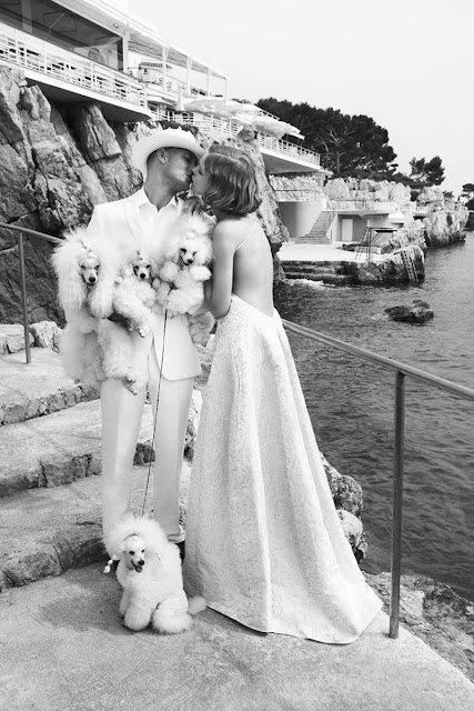 |
| Natalia Vodianova by Mario Testino (Source: ohlalalamag.com) Mario Testino Photobooks The photo is part of a fashion series (made Art DÉCOesque) by Mario Testino photographed at Hotel du Cap-Eden-Roc |
Just like us, the people, the appearance is also "sales-promoting"- beauty simply increases the market value! But what is the best market value good for if you don't have the ground rules of courtoise and respect for others ... then the most beautiful plate is a stupid a...
What applies to us also applies to everything created by mankind. We stand in front of the object in admiration and amazement with "ah´s" and "oh´s", which seems to be perfect and harmonious in front of us. Be it a car, a building, a painting, a sculpture or a ship.
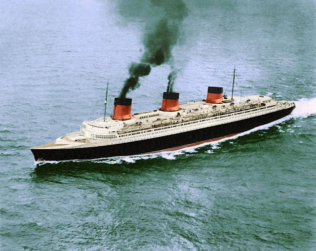 |
| NORMANDIE of Cie Gle TRANSATLANTIQUE, (Books) is considered as the most perfect liner ever - colouring courtesy by Daryl LeBlanc |
Is the appearance of ships important?
Quite a few consider NCL's NORWEGIAN EPIC to be the most ugly ship ever built for a shipping company.
I am sure that some of the NCL's new building, built in the last years, will find EPIC and the others beautiful, or well ... they will certainly have more of their interior in mind. So their equipment, the design of the rooms, the furniture, the food on board, the ports of call (routing), and there are quite a few people responsible in the cruise industry who say: "It all depends on what's inside! He's in the ship, not out. And when he does, he explores the area. The customer doesn't care what a ship looks like."
Especially the last statement makes me pensive. Do the strategists and new building planners and architects pay so little attention to what their customers might find beautiful, or to their eyes, and thus to their well-being?
If you look at the series of new buildings for the international cruise, it seems that the planners on the floors of the cruise industry do indeed give a "what's-her-name" to the appearance of their ships. Adding WOW and fake glamour ... The important thing is what the resort rinses on the water (the ship) in revenues into the cash registers.
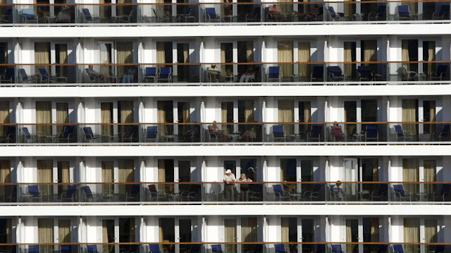 |
| Chicken stall like cabins with balconies of a modern day floating hotel at sea |
The result of the "democratisation" of the cruise vacation - masses are booking a cruise holiday
The cruise lines, in a strategic offensive, launched by themselves, strated to build balconies in front of the cabins, which led to the fact that the ships today resemble more like carton-like hotel complexes on land than they represent a ship ... And please don't misunderstand: I love a balcony in my hotel on land and on the ship. And I grant it to everyone! This box-type construction allows the client to have as many similar cabins and suites as possible (big staterooms [large cabins] - suites are actually, and still are, a succession of rooms separated by walls with doors) a balcony in front of them is just an addition. But it should be more than just a chicken ladder. And that in turn leads to income. Interestingly equal staterooms are divided into a myriard of different categories, which is a mystery to me.Now I really believe that beauty is always in the eye of the beholder - a purely subjective feeling. But you will agree with me that ships such as NORMANDIE of COMPAGNIE GÉNÉNERALE TRANSATLANTIQUE of 1935, BREMEN and EUROPE of NORDDEUTSCHER LLOYD (today HAPAG-LLOYD CRUISES) of 1929/30, FRANCE of COMPAGNIE GÉNÉNERALE TRANSATLANTIQUE of 1962, MICHELANGELO and RAFFAELLO of ITALIA S.p.A. of 1965 and QUEEN ELIZABETH 2 (in her original appearance) of CUNARD of 1969 each are beauties.
 |
| EUROPA entering the North River - copy from Die glanzvolle Zeit der Luxusliner, Kurt Ulrich |
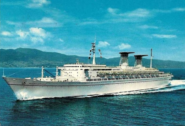 |
| MICHELANGELO steaming ahead - copy from a postcard, collection Earl of Cruise |
As BREMEN and EUROPA, MICHELANGELO and RAFFAELLO broke with traditions of old designs, their lines despite graceful and clear, but their purpose was clearly to be seen: passenger liners.
 |
| QUEEN ELIZABETH 2 - © Beken |
For British conservative tastes QUEEN ELIZABETH 2 was radical with exterior and interior design. She was a "child of her times" the progressive 1960s.
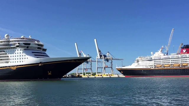 |
| Right DISNEY MAGIC, left DISNEY FANTASY. The latter one is an evolution of the prooven retro-futuristic original design - courtesy DISNEY CRUISES |
Looking at today's ships, it looks like a bus that prevents you from going fast on the left lane of the highway ... or were they the trucks?
However, there is one particular exception. And it attracts hundreds of thousands of onlookers every time they visit the Hanseatic city of Hamburg - the QUEEN MARY 2 of the CUNARD. But it is also a water-based resort designed to maximise profits. But it gives a hint of why nations and peoples recognized each other in their ships or at least believed it.
 |
| QUEEN MARY 2 during CUNARD´s birthday celebration 2015 in Halifax - © FPI Images |
DISNEY even went so far as to ask their potential customers how they would imagine an ocean liner on which they wanted to spend their holidays. The result was the current design of these ships, which are unique in the industry. The near to equality design of modern, caused by platform strategies and revenue reasons makes it a surviving aspect the paint the brand name on the hulls, use a specific brand naming strategy and paint the hulls, as if a flamigo is seasik ...
The DISNEY lifeboats, as with all modern passenger ships, are "barely" above the waterline, but on the top deck imitate glazed bulges, the boats mounted on top of the old ocean liners.
And the DISNEY cruise ships are by no means loss-makers. They have been designed just as tough as the hotel boxes, which have a bow at the front and screws under the waterline so that they can carry their cargo - the passengers - from A to B. They are just as tough as the hotel boxes, which have now bow and screws under the celars.
Older ships disappear from the organizers' brochures every year because they can no longer be "sold" to customers. Firstly because they have simply become "weakened by old age", secondly because their cabins are too small, thirdly they don't have balconies, need too much staff compared to the mega cruise ships, and much more. And most of the time it is cheaper to build a new ship than to bring an old one up to the current standard. And we have security demanding SOLAS regulations. And that's how they find their way to the wreckers.
 |
| Hotel ss ROTTERDAM in Rotterdam - courtesy, photo by Bob Rodenberg |
After a number of bancrupcies of previous owners, financial difficulties, technical problems during the restauration, the actual concept for the preserved ROTTERDAM seem to be resilient successful.
Preserving them? There is only one ship successful in its new role as moored hotel - ss ROTTERDAM of 1959.But just as beauty or ideals of beauty change over time, so do our views on beauty, or the look, on a car, a building or a ship.
For example, P&O CRUISES? ORIANA 1995 and AURORA 2000 were back then denounced as unattractive, but today they are seen as classics on the world's oceans, which, in addition to the usual box design of today's day, have a line (although a "compressed" one).
But a classic will only become a classic after a while. And our cruise ships of today will also be classics in a few years' time.
But despite all the understanding of the need for income, isn't it possible to have a little more style - a certain feeling for forms, proportions and lines that are pleasing to the eye?
And such "beautiful lines" also promote the pride of the guests on board, who prefer to be proudly photographed in front of the "beautiful lines" of a ship when it is generally considered a beauty. And this encourages the not to be underestimated repetition factor. A beautiyful ship is too a marketing benefit, it is risinf the recgnition and anticipating of the company. With the outer beauty (from the eye of the beholder!) the pride grows with it to sail across the seas or disembark in a destination. "Oh you sailing on that beauty?" who would not "brag" or being proud to answer "Yes!"?
That is for the exterior, and it is the same about the interior design.
Except for the luxury market, but not all, interior designs cater the WOW loving mass market cruisers. Who are easily impressed by faked "Las Vegas styled luxury". Glueing a crystal chandelier under the the cieling, does not make any luxury, or golden gleaming upward winding staircases. For the staircases, they are eventually made of brass, if. But don´t expect it, it is more likely plastic.
It is for the interrior the same as for the exterior, beauty is in first place in the eye of the beholder. And what someone has learned to think of as beautyful. But again it is the ruling "golden ratio" that commonly is, yes: `dictating´, beauty.
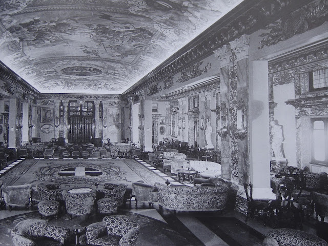 |
| Salla Colonna on board the ART DÉCO liner CONTE DI SVOIA - copy from Luxusliner, Kurt Ulrich Books about Palazzo Colonna |
 |
| CONTE DI SAVOIA - courtesy coloured by Steve Walker |
 |
| The original Galleria in the Palazzo di Colonna - Source: Wikipedia |
When the above b/w photographie was posted at FB it initiated a discussion of pros and cons about design and outfitting, styles and tastes.
The galleria was started to be constructed and outfitted 1650, 1703 it was finished as the Colonna´s art gallery. It was the time of Baroque, when this galleria was started. Then as it was, as during the last centuries, a neccessaty to show power and social standing in glamurous buildings and extraordinary interiors.
 |
| Bright, yes, but I guess not only for me a bit too much of fake gold, Earl of Cruise Modern day Baroque, the chep and awful style for WOW´s |
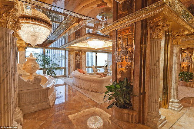 |
| Trunp Manhattan Penthouse - Source: MailOnline |
Top and below, the style of social climbers with lack of taste and style. Pumped with gold, glitter and bombastics, typical for those with inferiority feelings. Far away of the pompus of ancient
potentates.
potentates.
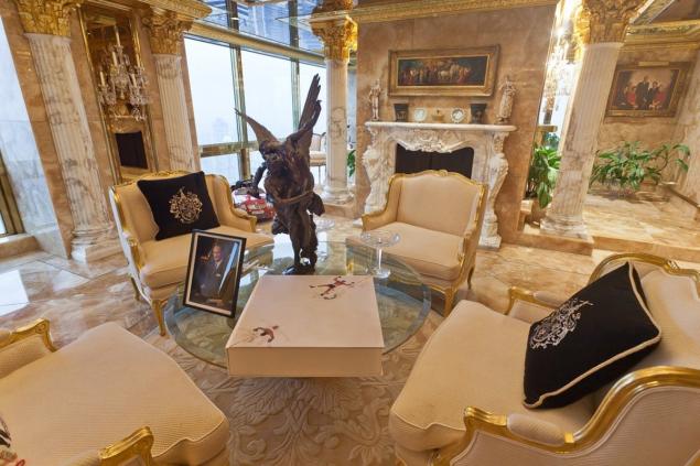 |
| Trunmp Manhattan Penthouse - Source: MailOnline |
Gerd Wüsthoff "The problem is, when the liners became Grand hotels, we had the BELLE ÉPOQUE. That style was ostentatious, as there had been uncountable Nouveau Rich, social climbers, that did want to copy the lifestyle and interiors of the old aristocracy. This happend in Europe as well in the Americas. Ships had then become the copy of shore mansions, castles and Grand Hotels. Only with the ART DÉCO we got a new style, which we now recognize as Ocean Liner Style, as the art movement turned at sea into a new style. And this was for the first time in shipping history - an onboard style influenced the shore based style. ART DÉCO was not an art school as BAUHAUS. Therefore it was free and floating, and more important it implemented regional arts and flows - in the States, in Great Britain, in Brazil, etc. each country and with that society had its own ART DÉCO - vive la différence!
When dictators occupied the style of ART DÉCO and incorporated it in their bombastic, humiliating man style, ART DÉCO corrupted ... and equaled with the era of opressions."
Jim Kalafus "Present day cruise ships and the liners of the early twentieth century have quite a bit in common. Both are decorated to appeal to vulgar people with money to spend.
That is why Colonna Hall was so tragic.
Throughout the latter half of the 19th century there was an evolution towards simplicity and modernism in architecture. From Eastlake, with its new interpretation of old forms, to Sullivan, MacIntosh, Wright, Gill, Urban, the movement progressed nicely. By 1900 pieces were coming out of Glasgow, Vienna, Paris, and Chicago that do not look dated 117 years later.
Gerd Wüsthoff "And don´t forget Wiener Secession."Jim Kalafus "Then there was the WHITE TRASH WITH MONEY school of design.
People who got rich selling laxatives wanted the accouterments of Old Money. They tended not to embrace the elegant simplicity of the era. They wanted Louis XIV; Tudor; Jacobean; 17th Century Dutch; 19th Century Italian; "A staircase identical to one found in an 18th Century French Chateau" leading to an Adam style whispering gallery, and all under the same roof.
People who had an authentic Louis XIV bedroom tended not to be impressed by mass-market repros. Just as, later, people with columned 19th century southern homes were not impressed by badly-proportioned suburban repros of said.
The liners of that era did not conform to any standards of good taste despite what advertizing copy claimed. Like today's cruise ships they piled it on double thick for the benefit of yokels. You stepped thru an amusing hodgepodge of styles, just as in The Shoe Blacking Baron From Muncie's mansion, spanning countries and centuries. Designed to make the newly moneyed go 'Wow.' MacIntosh; Wright; Gill never entered. Only a few rooms on the GEORGE WASHINGTON stepped into the 20th century and away from the "Rubes want it, so we give it to them" school of interior design.
Thing is, after 1907 even the rubes didn't want it. The ultimate `HILLBILLY WITH MONEY mansion, the Clark house, made its bow. The Copper King From Montana saw his huge home on Fifth Avenue shredded by both the architectural press and the general public. And with that, the entire WHITE TRASH WITH MONEY´ period of design died. Post Clark, even the most new money of hillbillies no longer wanted Louis XIV; Tudor; Jacobean; 17th Century Dutch; 19th Century Italian; "A staircase identical to one found in an 18th Century French Chateau" leading to an Adam style whispering gallery, and all under the same roof. The final round of mansion building was "chaste" to the point of being severe. And the first of the giant `EVERYTHING, AND TWICE´, houses in the Fifth Avenue corridor was sold off and demolished within a year of the Clark implosion, as other (older) New Money scions were forced to admit that very little separated their own mansions from Clark's.
The TITANIC´s suite furniture, but of better quality, could be purchased mail order from Sears or Montgomery Ward in 1912. High style? Hardly.
The mid-1920s saw a great design evolution in ships. Unified interiors that were of the moment, and not safely twenty years behind the times. They still piled it on thick, but were not targeting Bootleggers Who Got Rich And Demanded Rococo. There was a movement towards simplicity, just as there was on shore. ÎLE DE FRANCE was over the top. CONTE DI SAVOIA considerably sleeker. Raymond Loewy's last minute entries before the war spare and elegant. CONTE DI SAVOIA, for the most part, strove to whisper rather than shriek.
That is why Colonna Hall sets my teeth on edge. It is a throwback to a vulgar era. When the press of the early 1930s wanted to denote "Criminal rube who got rich" invariably they showed the character in Rococo surroundings very much like Colonna Hall. It's a canker sore in an otherwise pleasant series of rooms. Trumpean. When people in the 1930s thought "Nadir" they thought Rococo. The space had so much potential and it ended up looking like The Great Room in a bootlegger manse.
A
neck is far more beautiful unadorned than it is draped in rhinestones.
Only the most gauche are impressed by imitations. The space left
entirely undecorated would be far more satisfying than the space fitted
out as it is. The ship had an interior that actually reflected
progressive architecture on shore. Then there was this rhinestone of a
room dropped in the middle."
I grew up, lucky, in an elaborate styled home and had a lot of art and style loving relatives and their friends around me. An education from the very beginning in my childhood
But as I said/wrote earlier, beauty is in the eye of the beholder. But we have the "Golden ratio/cut", which is within all of us, as scientists recovered in our genes. Unfortunately the style and the love for is based on "education", not from the school, but the education from our upbringing, our socialisation in the respective societies.
When the sweat pant is the standard, you may even think a blazer and shirt combined with jeans is overdressed, what about a suit ? Is it then ostentacious?
We all, me included, judge from a personal point of view. But there is the common sense of the "Golden ratio/cut" ... the Greeks made a "school" of it and carved ideal statues, errected perfect temples and such ... why throwing overboard style and creating eye-maldies?
When I embarked onboard CARNIVAL TRIUMPH, some time ago for a travel review, I shrieked about the interior design. I told to Arnold Kludas, who was with me a guest onboard: "Joe Farcus should be sued for causing eye-cancer!"
Having style is somehow "natural", despite but one can learn. You should be openminded!
CARNIVAL´s interiors reflect the targeted clientele, and serves what they think is "luxurious". John Maxtome-Graham stated in a TV show: "They aimed at the lower end of the food chain."
I grew up, lucky, in an elaborate styled home and had a lot of art and style loving relatives and their friends around me. An education from the very beginning in my childhood
But as I said/wrote earlier, beauty is in the eye of the beholder. But we have the "Golden ratio/cut", which is within all of us, as scientists recovered in our genes. Unfortunately the style and the love for is based on "education", not from the school, but the education from our upbringing, our socialisation in the respective societies.
When the sweat pant is the standard, you may even think a blazer and shirt combined with jeans is overdressed, what about a suit ? Is it then ostentacious?
We all, me included, judge from a personal point of view. But there is the common sense of the "Golden ratio/cut" ... the Greeks made a "school" of it and carved ideal statues, errected perfect temples and such ... why throwing overboard style and creating eye-maldies?
When I embarked onboard CARNIVAL TRIUMPH, some time ago for a travel review, I shrieked about the interior design. I told to Arnold Kludas, who was with me a guest onboard: "Joe Farcus should be sued for causing eye-cancer!"
Having style is somehow "natural", despite but one can learn. You should be openminded!
 |
| CARNIVAL TRIUMPH Main Lobby - courtesy CARNIVAL |
When entering from Miami´s sun drenched pier into this room, I was greeted by plastic, that was crying "I am plastic, but want to look as lime stone!" The decor was some mix of Maya-Atztecan-Middle America, combined with black neon and in the centre a yellow light bulb ... argh ... Awful, to be true, is not enough.
 |
| CARNIVAL TRIUMPH Main dining Room LONDON - courtesy BeyondShips |
The atmosphere was/is all over plastic and too much of everything cheap. When I sat down for diner, I touched the tissue, plate and glasses, trying if it was plastic too. to me it is: cheap as cheap can.
Who is used to style and loving it should avoid the budget cruise ships, otherwise he won´t get lucky. And allways wearing sunglasses indoors is not a solution.

Comments
Post a Comment